NNN FAIR 2023
SSPAST EDITIONS
PAST EDITIONS
11.2021
T_AKUT
: fear as shared experie
︎ Editions Index
VISUALIZING THE IN-BETWEEN LENS: A CONVERSATION WITH
WANWAI SHUM ABOUT DESIGN
TYPE
Interview
DATE
December 2021
PLACE
Showroom MAMA, Rotterdam
Being part of MAMA’s Poule programme this year, I was given the opportunity to share my understanding of the Five Elements theory through the exhibition, Ancestral Fortune, which took place at Showroom MAMA from the 18th of June to the 15th of August 2021. The exhibition looked at The Five Elements theory from different angles and expressed them through artworks. My motivation for Ancestral Fortune came from my curiosity about the Five Elements theory, with which I grew up as a Thai of Chinese descent.
The Five Elements theory is an old Chinese philosophy that explains how everything in the universe affects everything else including humans’ personality and health. On the one hand, the theory has been passed on from one generation to the next without any doubts. On the other hand, many questions arise when we look at it from scientific and modern perspectives of today. My point of view shifts back and forth between these two. So, during my search for a graphic designer, I especially looked for someone who can translate this feeling of shifting through the visual identity of the show.
Recommended by a friend, I found Wanwai Shum, a graphic designer at Studio Dumbar in Rotterdam. Wanwai is originally from China but has been in Europe for quite some time since her studies in Antwerp and Eindhoven. Her work grabbed my attention right away as her style is a hybrid of the West and the East — an in-between lens which I used to curate the exhibition. After working with her, I am intrigued to get to know Wanwai better through this conversation.
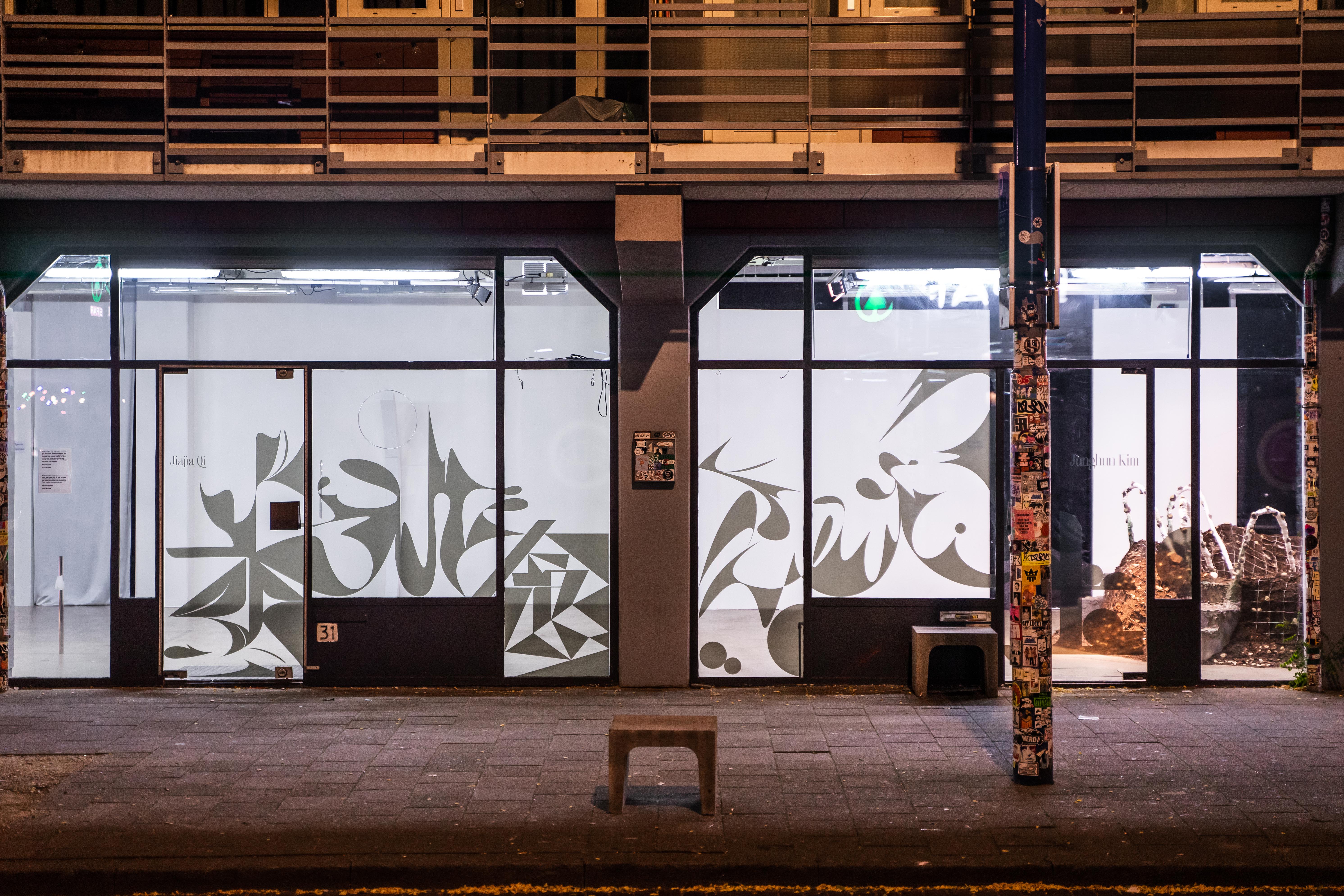 Window sticker of Ancestral Fortune designed by Wanwai Shum | Photo by Steven Maybury
CONTEMPORARY USE OF THE FIVE ELEMENTS THEORY
A conversation between a Chinese person like Wanwai and someone of Chinese descent like me, both about the same age, became interesting as we suddenly felt connected though we are not from the same country. It was Chinese culture that bonded us; especially those sayings from parents that we find nonsensical but somehow do manage to explain many situations. For example, my mom often tells me to eat a winter melon because water in the melon can balance out my body since I am Fire according to the Five Elements theory.
As the name suggests, the theory comprises of Five Elements: Wood, Fire, Earth, Metal and Water. All elements are interconnected and affect one another. Altogether, they create a continuous cycle. The theory serves as a basis for Chinese lunisolar calendar, Feng Shui, Chinese medicine, and acupuncture amongst many other practical or spiritual applications.
Whilst my mom applies the Five Elements theory in food, I learnt from Wanwai that the Chinese apply the theory in everyday life. “For instance, it’s common for Chinese parents to find out which element(s) their child lacks by checking the child’s birth time, date and year. To compensate for the shortage, the parents name the child with characters that consist of the missing elements,” she explained. When a name suffices according to the Five Elements theory, it is considered good luck.
Wanwai further explained that unlike many languages, Chinese doesn’t have alphabets. An alphabet is a set of letters or symbols that represent speech sound. It doesn’t have any meaning by itself. On the other hand, each Chinese character indicates pronunciation and has meaning in itself. So, for example, the child’s name can be one character or a compound of characters which contain(s) one of the five elements. In other words, characters work similarly to prefixes and suffixes in English. They indicate sounds and meanings of a word.
Since the Five Elements theory is ingrained in Chinese culture and language, Wanwai told me that she immediately had an idea for visuals of the exhibition after I first told her about the exhibition concept. Wanwai wanted to play with the Chinese typography of the five elements.
“Chinese characters are essentially pictures of what they refer to”. Wanwai explained to me that Chinese characters are already visuals in themselves, there is no need for additional images for design references. So, the five Chinese characters meaning wood, fire, earth, metal and water were transformed into the visual identity of the exhibition.
However, both Wanwai and I agreed at the beginning of our collaboration that we wanted to stay away from clichés of Chinese aesthetics, which are often portrayed with the colour red and yellow, a dragon, and a stylized Chinese typeface. Wanwai explicitly diverged the design of the Chinese characters to be less legible. She created some vivid stripes to connect all the shapes together as a circle. The circle is in fact the core of the Five Elements theory where everything is interconnected and continuous. Wanwai further mentioned that shapes of each element also define their tone of voice. For example, fire and water are sharp. Metal is associated with shininess and reflection. Wood gets translated into leaves. Earth is dust. These tones implied how each element looks, and incorporated these connotations into the conceptual process of her design.

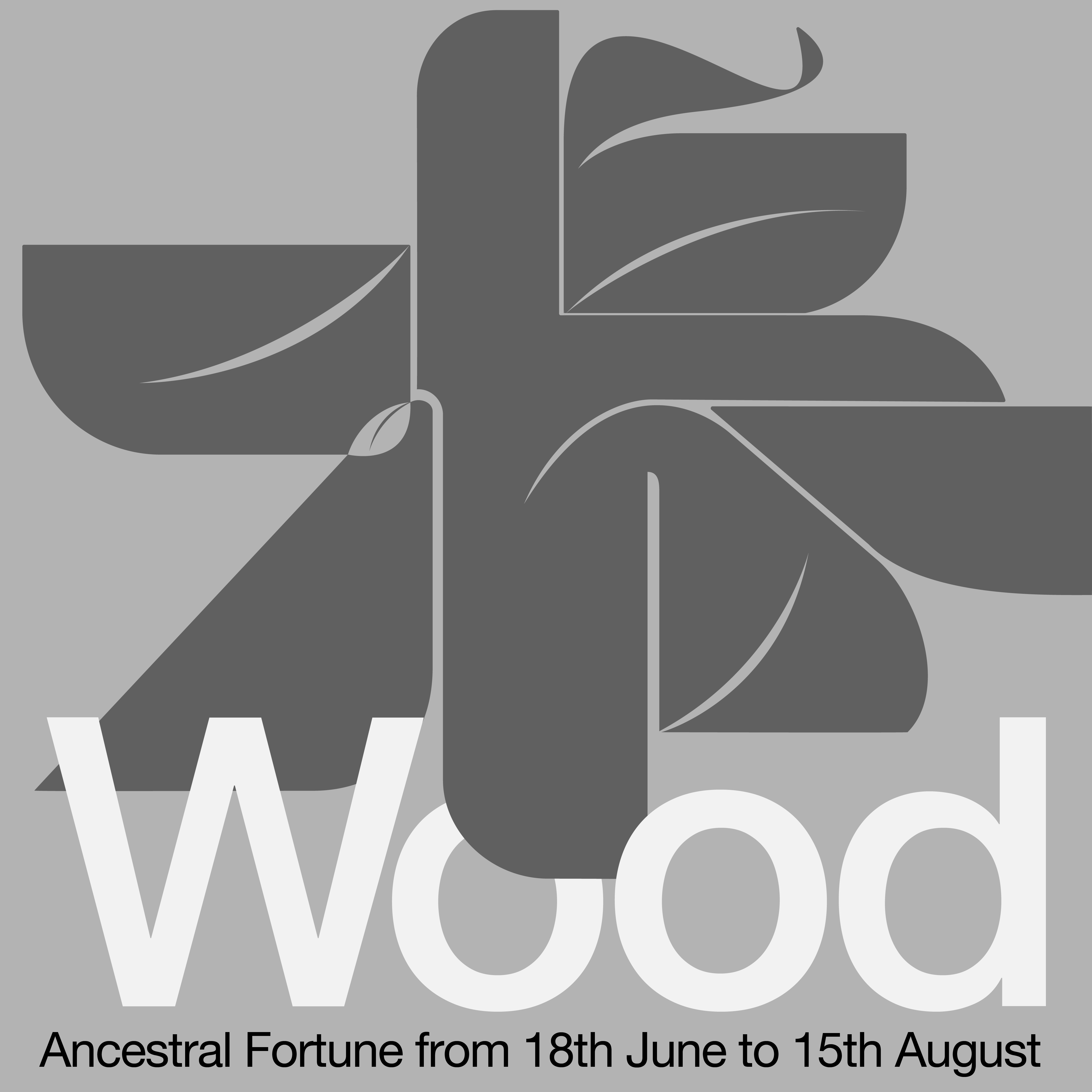
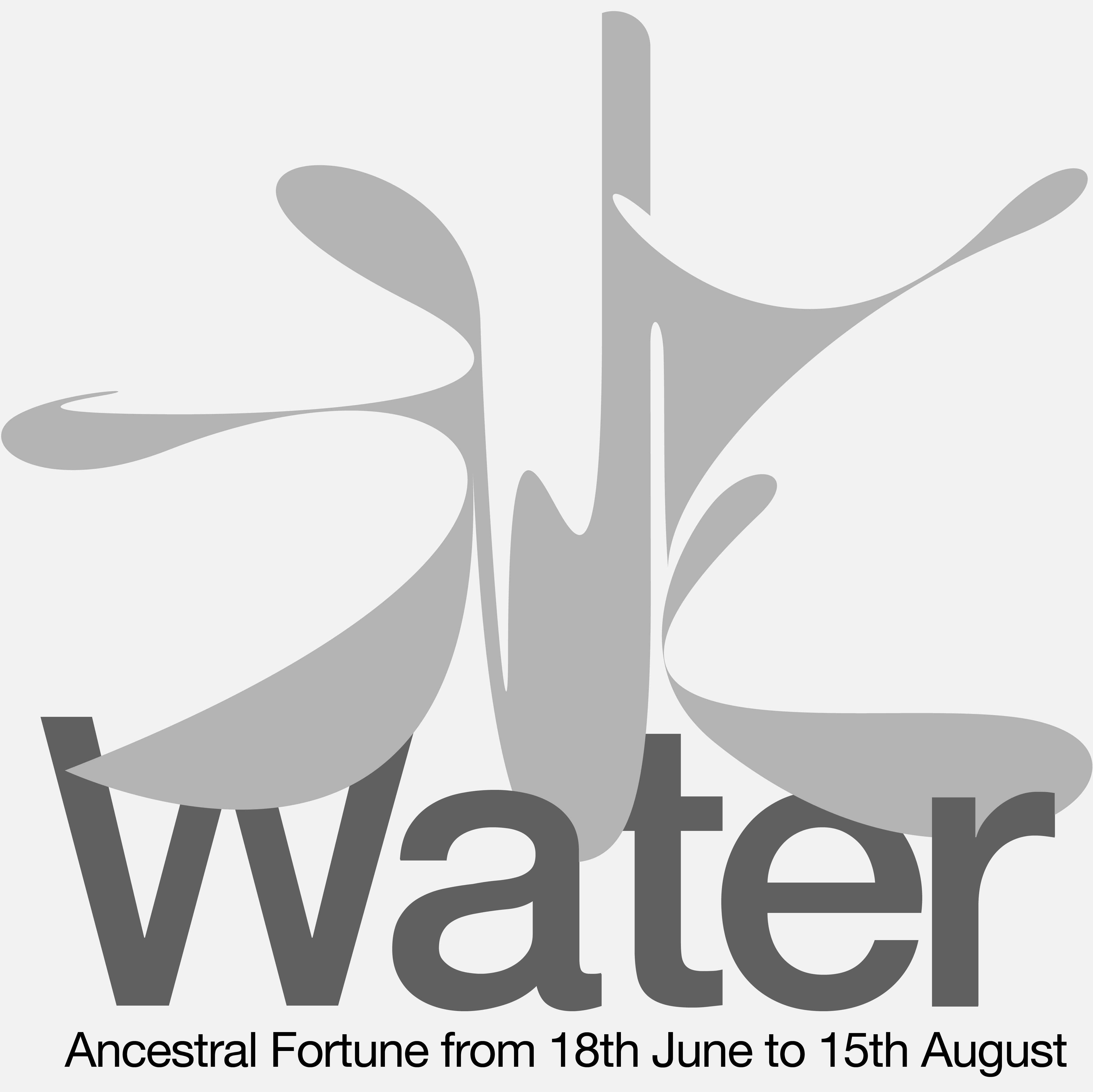


Images of each of the five elements for MAMA’s Instagram posts | Designed by Wanwai Shum
DIFFERENT AND DETERMINED
Wanwai was interested in Chinese calligraphy at a young age. Fascinated by strokes and rhythms, she has mastered the skills and got accepted in an art academy in China. However, Wanwai told me that Chinese art has not been a popular subject amongst students as it traditionally focuses on studying masterpieces and mastering techniques, instead of focusing on conceptual processes like how art is taught in schools in Europe and America
Despite being accepted to the art academy, Wanwai thought that studying there would restrict herself only to the art bubble. That’s why she decided to study visual communication at a university, allowing her to expand her perspectives outside the art world. Although the art and design in her course were taught conceptually, Wanwai said that the course's main focus was to strive specifically for commercial goals. Only until she went for her exchange programme in the UK, did she realize that art and design isn’t only about selling beautiful things. Wanwai: “They can also tell stories''.
After her Bachelor degree, Wanwai moved to Antwerp for her master's degree. During her study, Wanwai did an internship at design studio Vrints-Kolsteren which, in Wanwai’s own words, “changed her life”. At Vrints-Kolsteren, Wanwai was involved in projects from A to Z, unlike internships that she had done previously in China. She felt the freedom and trust from colleagues, who challenged her to learn, and encouraged her to be creative instead of expecting her to deliver a certain design.
After the internship, Wanwai moved to the Netherlands to study Information Design at Design Academy Eindhoven. Moving to Europe, she said that she had to relearn everything about typography, due to the latin alphabet which is inherent to a big part of Western-Europe. Wanwai explained that the first difference is that Chinese characters have more shapes. This makes her work more detail sensitive whenever she works on typography today. Second, colours are significant in her design as they have different interpretations in different cultures.
“Dutch design, like the dutch culture, is more straightforward than Belgian design. Antwerp has a more elegant and poetic style, whilst Dutch culture is more bold and outspoken which is translated into the efficiency and simplicity of the Dutch design.”
Now, Wanwai works at Studio Dumbar where uniqueness and differences are appreciated. “Here, everybody is creative. So I would like to focus on enriching my unique design language to reach a larger audience, and learning to collaborate with people from different cultures.” This is also when Wanwai realized that her knowledge and skills in Chinese art are important to her career, as they make her different from the rest of the team.
Wanwai told me that designers should have their own personalities rather than making and showing nice trendy things. Even with commercial commissions, she tries to involve her personality in her design language.
Reflecting on art and design in China today, Wanwai: “there are less strict rules in design and details in China. As a contemporary profession design has a shorter history than in Europe, there is no single 'standard' of aesthetics. Therefore, everything becomes possible. Designers have more room to do what they want. Although the majority of clients focus on the superficial outcome of the design that looks cool and unique, the design process starts to become deeper in concepts.”
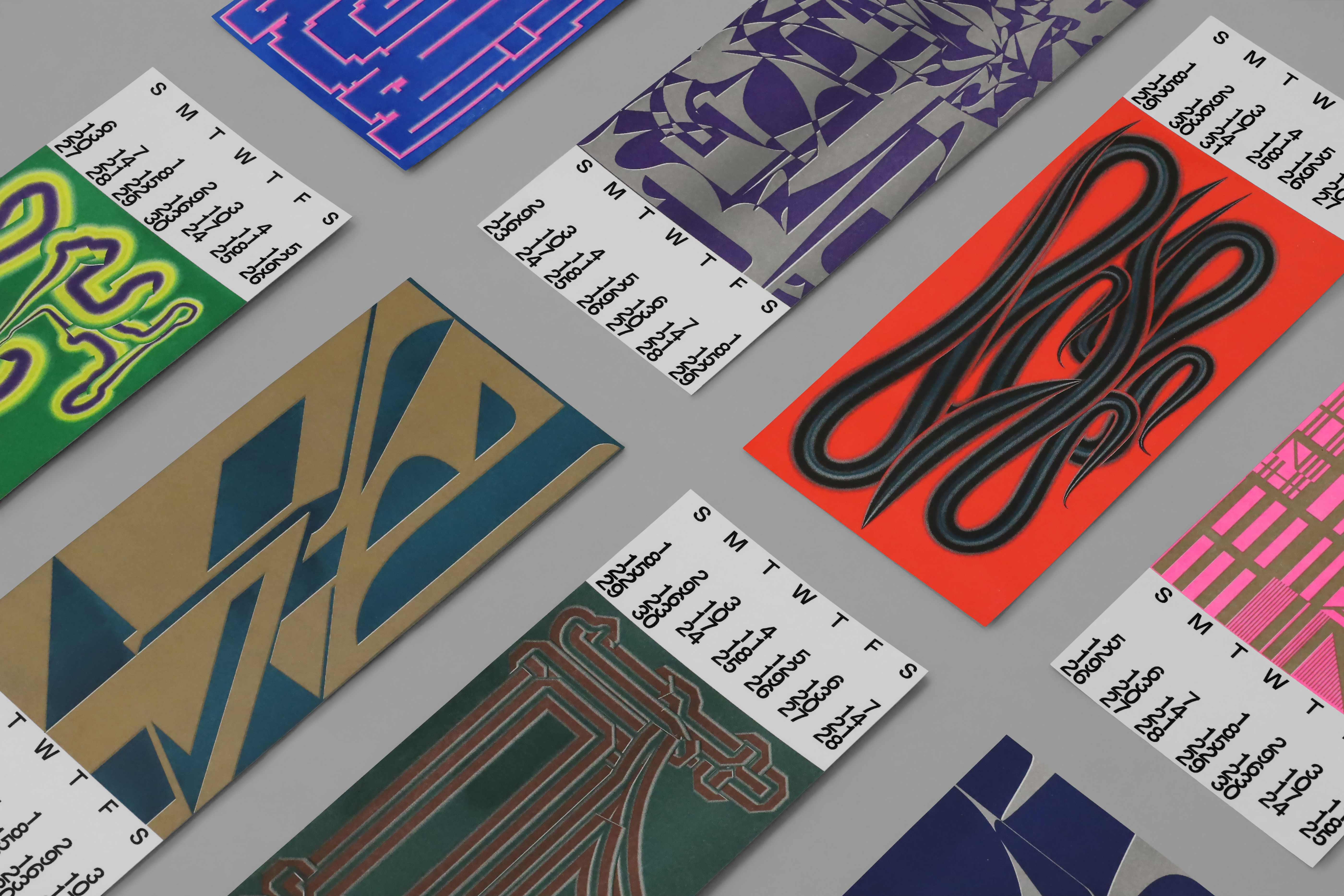 Wanwai Shum&Yu-Cheng Hsiao : 2020 Calendar, Copyright © Wanwai Shum and Yu-Cheng Hsiao, 2020
MY TAKE ON THIS
After listening to Wanwai’s story about design education and trends in China, I noticed two points. First, the art and design education is geared towards an appreciation of Western artistic norms, whilst leaving the Chinese art outdated and less valuable. Second, art and design should meet market demands and generate income. There is a high demand for conceptual art and design from commercial assignments because clients think it is cool as it is Western-like. So designers keep making and presenting that style, feeding the demand in order to make a living.
Wanwai and I share the same opinion on these two points, but only until we studied and worked abroad did we realize them. Wanwai: “Everyone should appreciate their cultural uniqueness, instead of trying to become like Westerners. Appreciate who we are. Be in as many different bubbles as you can. Only then will you be able to appreciate your uniqueness and love yourself more.”
I grew up looking up to the West, trying to be like the European or the American and often overlook my own culture. For instance, I was never interested in researching how the Chinese hand-torn calendar works and where the horoscope on the calendar comes from. In fact, I always found them illogical. Only until I learnt more about the Five Elements theory for this exhibition, did I understand how they came about and realize that both the theory and the calendar are based on factual observation of natural phenomena.
Today, I take the Five Elements theory with a pinch of salt in my everyday life. Though it doesn’t serve all aspects of my life, it does give something that soothes my mind. Likewise, my goal for Ancestral Fortune was to encourage visitors to realize how valuable their ancestral fortune is, even though it may not seem to be in line with ‘the norm’.
MAMA web shop
Ancestral Fortune
Wanwai Shum website
Interview by Honey Kraiwee